Design Your Own Art Project
Above: My final product (burning)
Project Reflection:
For this project, I created a tree out of matchsticks. I first used hot glue to stick together the matches for the trunk. At the same time, my partner was creating the top part of the tree, also out matchsticks as well. I made sure that I kept a hole at the top of the trunk, because we next put together the tree. In order to get a digital aspect of our project, we lit our tree on fire and took a video of it.
I chose to do this for my project because, when I saw a similar project to this on the internet I got really interested. I wanted to make my project personalized, but I got really inspired by the other projects I saw. The part that I was most excited for was lighting it on fire. I was really cool seeing how the fire reacted to our structure and the amount of glue we used. Over all, I wanted to try something that I have haven't ever thought of, never mind did.
It is important to communicate visually because of many reasons. First, it can allow many more people to see what you have created. Second, it can be inspiration for someone else's project. "A picture is worth a thousand words."
Logo Design
Above: Final Logo Design
Above: Beginning Sketches
Above: Layout Sheet
Project Description:
When I started this project off, my first step was to get all of my ideas out onto a piece of paper. I started drawing my initials many different ways to see what design I liked the best. The one I picked to refine was the letter "a" with a "t" connected to the bottom of it and then a 2 at the top to represent the second "a" in my initials. After taking my chosen design and drawing it bigger on another piece of paper, I scanned my drawing in and drew it in Adobe Illustrator. I then played with the color and font of it until I found something that I liked. My last step was, taking my logo and placing it on different things.
Project Reflection:
It is important to have an eye catching logo especially for business because, they can show what the business is about in just one picture. Just like the saying, a picture is worth a thousand words. Logos can show the unique identity of a business through the colors, fonts, and images put together. They are also a great way to advertise and get your information and purpose out.
The main skills that I learned throughout this project were, taking one idea and refining or adding to it. As well as, learning how to scan drawings into the computer, using Illustrator and Photoshop tools, and last, how to fit a logo onto an everyday item and make it look good.
The Truth of Happiness Collaborative Project
Project Reflection:
The Truth of Happiness Project was a collaboration between my Humanities class and my Digital Arts class. We learned most of the project content in Humanities, but we learned all the video making information/skills in Digital Arts. We learned about many ways and things we can use to make our videos better quality, including, animation, different angels and positions of shots, lighting, etc. I feel like this was a very content filled project, but learning how to make a good quality video by using many different skills can definitely come in handy in my future. One of the things I learned during this project, like most other projects is, time management. Being able to film and edit our movie in 2-3 weeks, and be proud of the work we did, as well as be able to show it at our exhibition and say "that's mine", was definitely a big challenge. One of my favorite skills we learned in class is, stop-motion animation. One of my group partner's created an animation for our video, which I feel like really added some depth to it, as well as setting our video apart from the other's.
Utopia/Dystopia Visual Aide
Above: Final Photoshop Project
Above: Proof Sheet
Project Description:
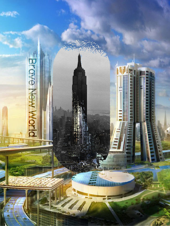
We did the Utopia/Dystopia project in Digital Art Foundations because, we wanted to create a visual aide that demonstrates either our version of a dystopia or utopia, or a new book cover for the book Brave New World. Like many people say, a picture is worth a thousand words.
We did the Utopia/Dystopia project in Digital Art Foundations because, we wanted to create a visual aide that demonstrates either our version of a dystopia or utopia, or a new book cover for the book Brave New World. Like many people say, a picture is worth a thousand words.
Project Reflection:
In order to create my Brave New World book cover, I used Photoshop. Many ideas from my Humanities class were incorporated, some being: utopia and dystopia concepts, happiness and Brave New World. For my project, I chose to recreate the book cover for the book, Brave New World by Aldous Huxley. My cover demonstrates the main concept of the book, which is, that they think they live in a happy and perfectly perceived utopia, but in reality they live drug filled, unhappy dystopia. The parts of the pill that are disintegrating demonstrates and shows the few people who have realized that they aren't happy and are trying to show other's that their world isn't are perfect as they think it is.
In order to create my Brave New World book cover, I used Photoshop. Many ideas from my Humanities class were incorporated, some being: utopia and dystopia concepts, happiness and Brave New World. For my project, I chose to recreate the book cover for the book, Brave New World by Aldous Huxley. My cover demonstrates the main concept of the book, which is, that they think they live in a happy and perfectly perceived utopia, but in reality they live drug filled, unhappy dystopia. The parts of the pill that are disintegrating demonstrates and shows the few people who have realized that they aren't happy and are trying to show other's that their world isn't are perfect as they think it is.
Teacher Creature
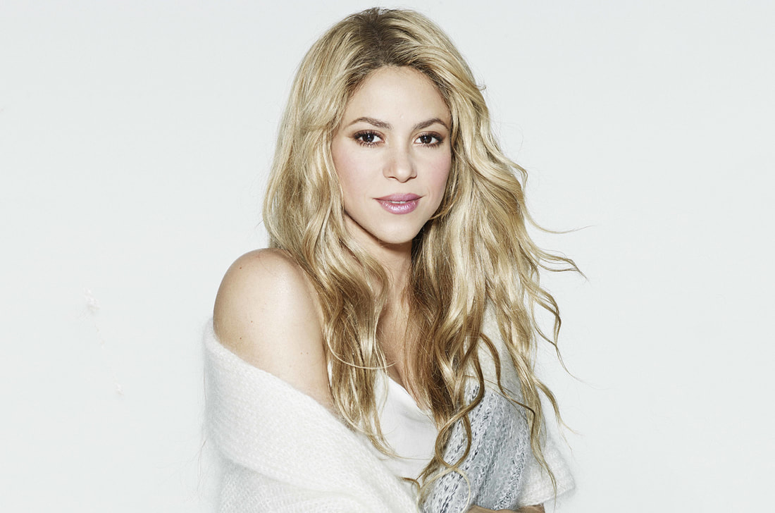
Final Photo shopped Project above
Proof Sheet above
Project Reflection
Since I went to Mountain Middle School, I already have 3 years of experience with the simple Photoshop skills. This project did improve my skills in making edges feathered and with making a face and a body look "right" together using Hue/Saturation and Exposure to make sure the skin tones match.
Since I went to Mountain Middle School, I already have 3 years of experience with the simple Photoshop skills. This project did improve my skills in making edges feathered and with making a face and a body look "right" together using Hue/Saturation and Exposure to make sure the skin tones match.
Tutorial Project
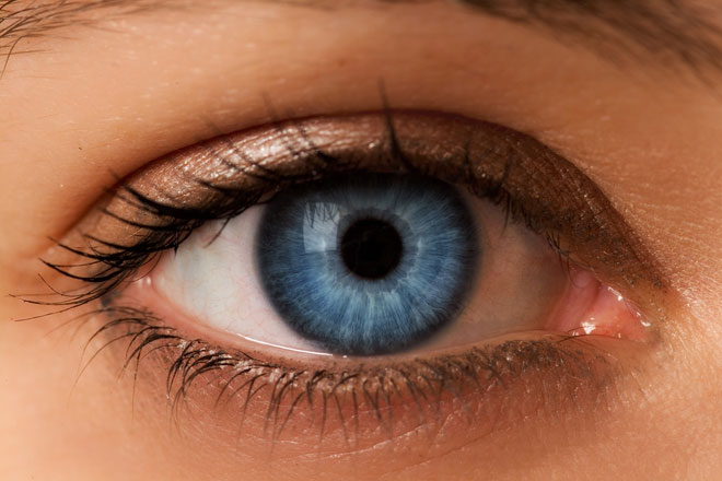
Original |
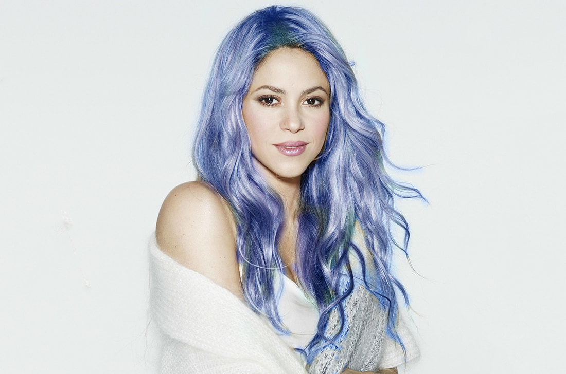
Photo-Shopped |
|
Tools I used:
|
Steps I took:
|
Original |
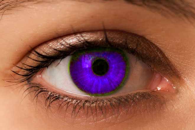
Photo-Shopped |
|
Tools I used:
|
Steps I took:
|

Original |
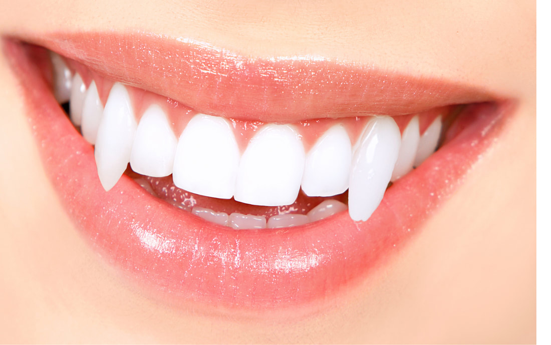
Photo-Shopped |
|
Tools I used:
|
Steps I took:
|
Letter Portfolio Project
Project Description:
To start this project off we were given cameras and we went outside into nature and looked at different possible things that could look like the letters in name. Once we found at least one picture for each of the letters in our name we came back into class and down loaded all the pictures onto out computers. We then started to bring them into Photoshop and crop them enough so it would fit into a certain sized page width. Once we got all of them to fir well, we were able to mess around with different filters until we found a creative cool look for our name portfolio. Since I all ready had three years of experience with Photoshop this project was more like a review for me. If I were to do this project again, something I would do differently is I would try to find more of a different variety of pictures that I could use for the letters in my name. The pictures that I did take I didn't like very much so once we were putting together the whole project, I went online and looked up different pictures and downloaded them. So I would definitively try to find my own pictures that I would take that I like enough that I would want to use it in my project.
